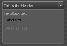
With minimal effort any of the supplied Windows Presentation Foundation (WPF) controls can be visually restyled to suit an application’s needs. With only a little more effort the control’s entire visual tree can be replaced using templates without affecting the underlying behavior of the control itself.
I recently found myself wishing the the toggle button on the Expander control was on the right hand side rather than the left. The following XAML can be pasted into XAMLPad to show the default look of the Expander control. I personally use Kaxaml for such purposes.
<Page
  xmlns="http://schemas.microsoft.com/winfx/2006/xaml/presentation"
  xmlns:x="http://schemas.microsoft.com/winfx/2006/xaml">
  <StackPanel>
    <Expander Width="200" Header="This is the Header">
      <Border Height="100">
        <StackPanel>
          <TextBlock>TextBlock text</TextBlock>
          <Label>Label text</Label>
          <Label IsEnabled="False">Disabled label</Label>
        </StackPanel>
      </Border>
    </Expander>
  </StackPanel>
</Page>
WPF applies the default control template for the current theme. On Windows Vista the above XAML will produce this.

A Style can set any of the public properties of a control. Of course the same public properties can be set in the control declaration itself, but the use of styles facilitates reuse and helps achieve a common look and feel across the application. Styles are typically declared as static resources in a window or application resource dictionary. Styles may be applied to a control either explicitly or implicitly. Each style declaration must specify to which control type it applies, and it may only apply to one type.
- A style must be explicitly applied to a control if the style if given a key in the resource dictionary. A style declared thusly,
<Style k:Key="ExpanderStyle" TargetType="{x:Type Expander}">...</Style>, must be referenced in the control declaration like this:<Expander Style="{StaticResource ExpanderStyle}">...</Expander>. - By omitting the Key from the Style declaration the style is implicitly applied to all controls of the appropriate type under the scope of the dictionary. For example if this is placed in the application resource dictionary,
<Style TargetType="{x:Type Expander}">...</Style>, then this style will apply to all instances of Expander in the application.
The following XAML shows how to implicitly style the Expander.
<Page
  xmlns="http://schemas.microsoft.com/winfx/2006/xaml/presentation"
  xmlns:x="http://schemas.microsoft.com/winfx/2006/xaml">
  <Page.Resources>
    <Style TargetType="{x:Type Expander}">
      <Setter Property="BorderThickness" Value="1"/>
      <Setter Property="BorderBrush" Value="DarkGray"/>
      <Setter Property="Foreground" Value="#202020"/>
      <Setter Property="Background" Value="#D0D0D0"/>
    </Style>
  </Page.Resources>
  <StackPanel>
    <Expander Width="200"
              Margin="0,8,0,0"
              Header="This is the Header">
      <Border Height="100">
        <StackPanel>
          <TextBlock>TextBlock text</TextBlock>
          <Label>Label text</Label>
          <Label IsEnabled="False">Disabled label</Label>
        </StackPanel>
      </Border>
    </Expander>
  </StackPanel>
</Page>

This Style changes the Expander to be visually more to my liking, however the toggle button is still on the left hand side. I want an Expander with the button on the right. There is no Expander public property to move the toggle button. Luckily the SimpleStyles sample in the Windows SDK does have such an Expander. Examination of the SDK sample shows that a control template must be used. I modified the SDK sample to my own liking. In addition to moving the button I wanted black/dark gray color scheme that is so trendy these days since the launch of Vista. The XAML below shows what I have done so far.
<Page
  xmlns="http://schemas.microsoft.com/winfx/2006/xaml/presentation"
  xmlns:x="http://schemas.microsoft.com/winfx/2006/xaml">
  <Page.Background>
    <!-- Window background brush removed for brevity-->
  </Page.Background>
  <Page.Resources>
    <!-- Color brushes removed for brevity.  Download code to see. -->

    <!-- Expander toogle button template.
           Removed for brevity.  Please download code to see. -->

    <!-- Expander style -->
    <Style TargetType="Expander">
      <Setter Property="Foreground" Value="{StaticResource ForegroundBrush}"/>
      <Setter Property="Template">
        <Setter.Value>
          <!-- Control template for expander -->
          <ControlTemplate TargetType="Expander">
            <Grid>
              <Grid.RowDefinitions>
                <RowDefinition Height="Auto"/>
                <RowDefinition Name="ContentRow" Height="0"/>
              </Grid.RowDefinitions>
              <Border
                Name="Border"
                Grid.Row="0"
                Background="{StaticResource HeaderBrush}"
                BorderBrush="{StaticResource NormalBorderBrush}"
                BorderThickness="1"
                CornerRadius="4,4,0,0" >
                <Grid>
                  <Grid.ColumnDefinitions>
                    <ColumnDefinition Width="*" />
                    <ColumnDefinition Width="20" />
                  </Grid.ColumnDefinitions>
                  <!-- The following puts the toggle button in the right hand column, just like I want! -->
                  <ToggleButton
                    Grid.Column="1"
                    IsChecked="{Binding Path=IsExpanded,Mode=TwoWay,
                                        RelativeSource={RelativeSource TemplatedParent}}"
                    OverridesDefaultStyle="True"
                    Template="{StaticResource ExpanderToggleButton}"
                    Background="{StaticResource NormalBrush}" />
                  <ContentPresenter
                    Grid.Column="0"
                    Margin="4"
                    ContentSource="Header"
                    RecognizesAccessKey="True" />
                </Grid>
              </Border>
              <Border
                Name="Content"
                Grid.Row="1"
                Background="{StaticResource GroupBackgroundBrush}"
                BorderBrush="{StaticResource OpenGroupBorderBrush}"
                BorderThickness="1,0,1,1"
                CornerRadius="0,0,4,4" >
                <ContentPresenter Margin="4" />
              </Border>
            </Grid>
            <ControlTemplate.Triggers>
              <Trigger Property="IsExpanded" Value="True">
                <Setter TargetName="ContentRow" Property="Height"
                        Value="{Binding ElementName=Content,Path=DesiredHeight}" />
                <Setter TargetName="Border" Property="BorderBrush"
                        Value="{StaticResource OpenHeaderBorderBrush}"/>
              </Trigger>
            </ControlTemplate.Triggers>
          </ControlTemplate>
        </Setter.Value>
      </Setter>
    </Style>
  </Page.Resources>

  <!-- Test : Removed for brevity-->
</Page>

I had to cut much of the code out because it is too much to list here. Download this XAML code here to see it all. Load it into XAMLPad to see how it works.
Notice how the expander control template has an outer grid and an inner grid. The outer grid has two rows, one for the header and one for the content. The content row has a height of zero and is thus not visible by default. A property trigger <Trigger Property="IsExpanded" Value="True"> sets this row’s height when the control is expanded. The header row contains another grid with two columns. The header content is placed into the left-hand column and the toggle button into the right. The button is now where I desire it to be.
The 3 XAML files used in this post are available for download Here
this is very sensible explanation of styling expander.
but what i am looking for is something to be used as visual studio’s properties windows like UI. remember? Like the expander they are using in the properties windows ?
can you help spotting similar to that?
regards,
Ashish Sehajpal
http://www.sehajpal.com
Hi,
This article really helped me..
I definitely appreciate this